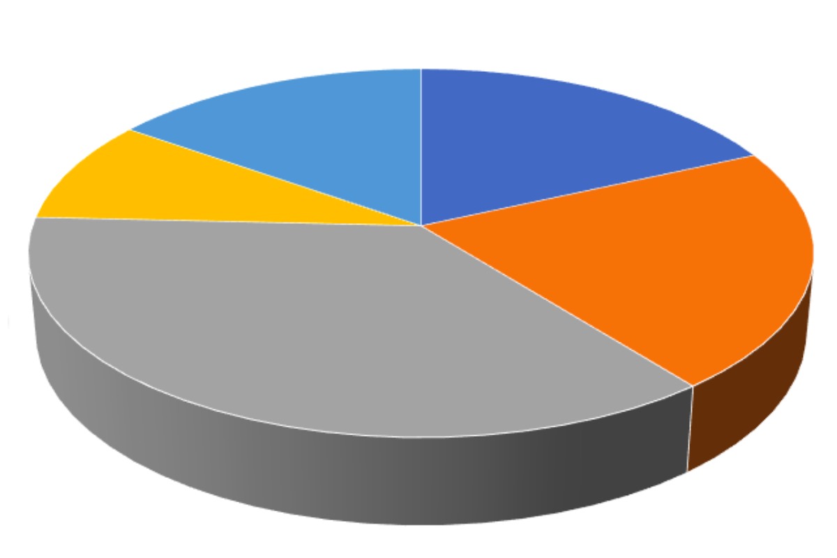
The charts that are circular in shape are called “circle charts” famously known as Pie charts in mathematics, these divide the graphic of circular statistics into slices or sectors regarding illustrating several mathematical problems. Each and every sector represents a balanced share of the entire circle for finding the composition of the things, the pie chart is the best bet for that calculation. There are many cases, where pie charts substitute some of the other graphs like line plots, bar graphs, histograms, etc.
Table of Contents
How can we try to make our pie charts appear better?
- A lot of skinny slices are difficult to read, try to use five maximum sections.
- Try to place the biggest slice first and then place the other ones around the circle for a good pictorial representation.
- Do not compare the pie charts together.
- Avoid the usage of 3D pie charts.
The data representation in pie charts is very interesting and important. It comprises different sections and sectors in which each section and sector of the chart forms some portion of the overall(percentage). The data total equals 360°.
The entire value of the pie charts is 100% always.
Try to follow the steps below for finding the percentage for these circle charts:
- Classify the data
- Estimate the total value
- Division of the categories is Vital
- Converting the data into percentages
- Compute the degrees in the end
Various uses of pie charts:
- Businesses use these pie charts to analyze the growth areas, revenues, turnovers, and exposure.
- Representation of categorical data
- Various types and kinds of houses are acquired by people in particular areas.
- The data of two and four wheelers acquired by people
- Count of customers entering retail markets during weekdays and weekends.
- Assessment of cuisines liked by various people in big events.
- Count of votes during elections
- Representing the data of particular cars that have been sold in a month.
Pie Charts have the following advantages:
- Pictorial representations are simple and understood easily
- Large amounts of data are represented as a division of a whole, visually.
- It provides a tool for effective communication helping the even unacquainted audience
- Compares and provides the data for spectators, making it easier for immediate examination or understanding information quickly
- There is no need for the readers to inspect or measure the underlying numbers on their own, they can be removed by making use of this chart
- If you want to make emphasis on a few points, The pieces from the data can be manipulated in the circle chart
Pie Charts have the following disadvantages:
- If the chart has a lot of pieces of data that are to be used, it is not very effective.
- If we have a lot of data to add to the chart, even after adding and labeling the numbers, they don’t help much, they become crowded amongst themselves making it very difficult to read.
- As only one set of data is represented in this chart, one needs a series of them for comparing numerous sets
- This might make it problematic for the readers when they want to analyze and adapt the information quickly
So now you are aware that pie charts take a fairly slender use-case that is summarized mostly in its definition. In case you want to use pie charts for your calculations, and not bar graph or any other tool, you should essentially have some sort of whole quantity that can be divided into various parts, and the chief objective of making the pie chart must be the comparison of every group’s influence on the whole, other than comparing the groups to each other. If you are not satisfied with the above-mentioned points, means the calculations in your pie chart are not suitable, and a different method of plotting should be used.
As is the case with other subjects of mathematics, pie charts require a lot of practices, there are several other examples stated online by Cuemath they also provide the best notes for a deeper understanding of the subject.

